

Lovebugs Sleep Coaching
Brand Identity & Marketing Materials
Overview
Lovebugs Sleep Coaching needed a brand that felt reassuring, approachable, and family-friendly while still maintaining a polished, professional appearance.
The goal was to create an identity that would appeal to exhausted parents seeking support while conveying trust, expertise, and warmth.
The Challenge
The visual identity draws inspiration from bedtime routines, comfort, and childhood wonder. Soft colors, playful details, and approachable typography were chosen to create a welcoming experience for parents while reinforcing the caring nature of the business.
Subtle moon and star elements help communicate the sleep-focused nature of the brand without relying on overly trendy or cartoon-like visuals.
Creative Direction
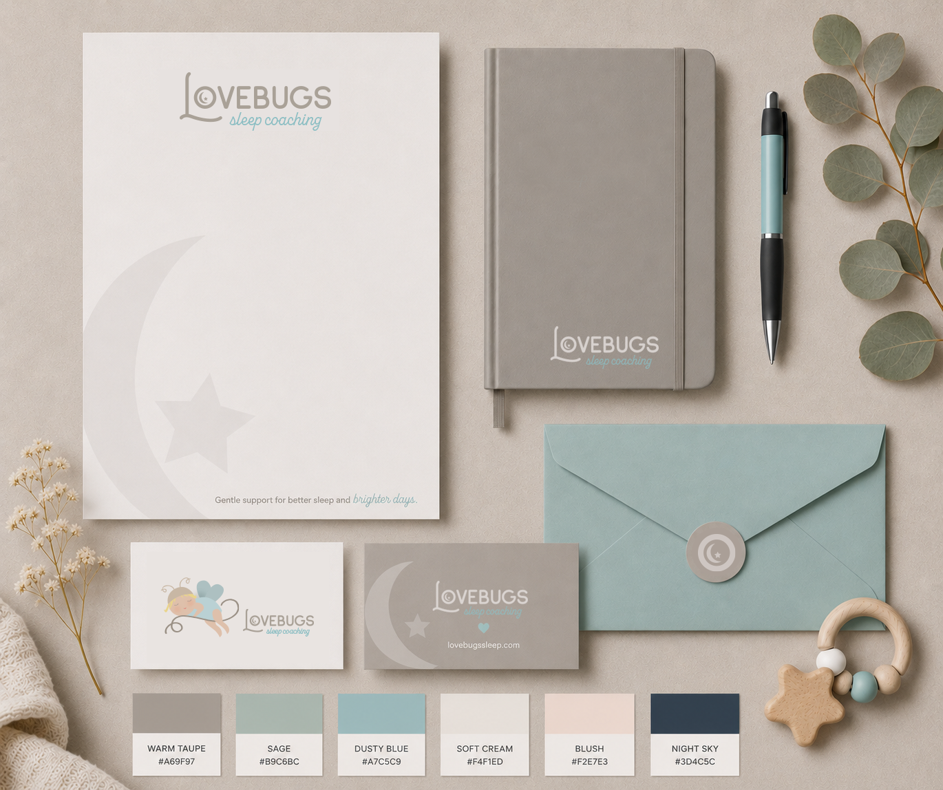
The creative direction centered on the feeling parents need most when they’re exhausted and looking for help: calm, reassurance, and trust. A soft palette of dusty blue, sage, blush, cream, and deeper night tones was paired with approachable typography and subtle moon-and-star details to reflect the comfort of bedtime without feeling overly childish. The result feels gentle and welcoming for families while still giving Lovebugs the polished, professional presence needed to inspire confidence.
The Outcome
Lovebugs Sleep Coaching is a family-focused brand designed to help parents navigate the challenges of infant and child sleep. The visual identity combines soft colors, approachable typography, and playful bedtime-inspired details to create a brand that feels comforting, trustworthy, and welcoming.
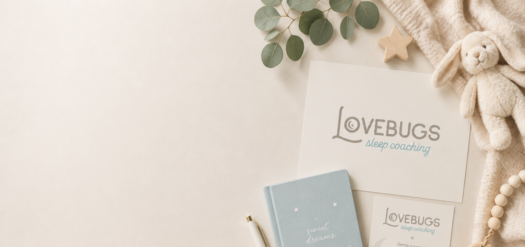
Hero image
Brand board
Logo suite
Color palette
Business cards
Marketing pieces
Website mockups
Deliverables
Client
Michelle McAvoy
Year
2017 & Refresh 2025